Onboarding flow redesign
Medium redesign

Why Redesign?
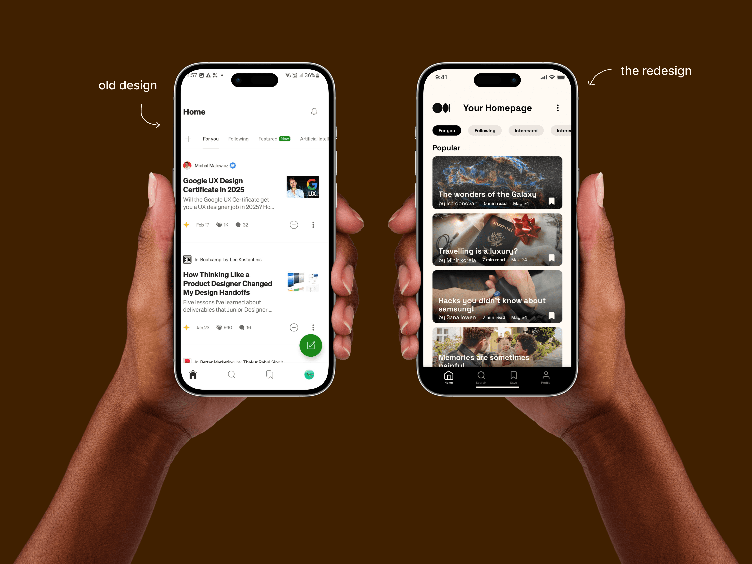
Medium is already a haven for readers and writers — clean, minimalist, and distraction-free. But what if it could be more than just functional? What if it felt like flipping through the pages of your favorite book?
Because reading isn’t just about consuming words — it’s about feeling them. And that’s what this redesign aims to bring: a Medium that feels like home for every story lover.
Problems with the Onboarding
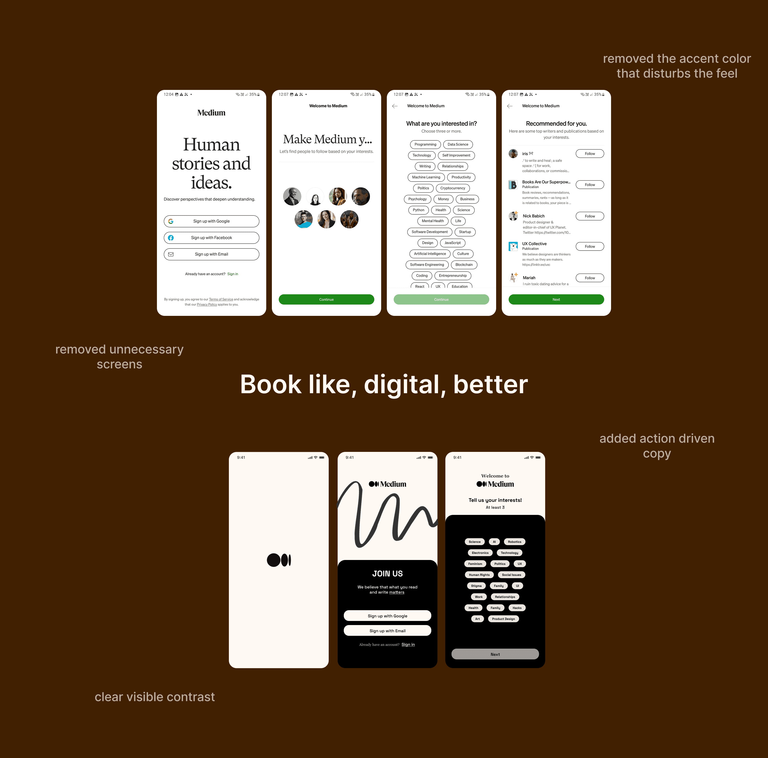
The current onboarding is too long and doesn't feel like medium at all.
the second screen is unnecessary and doesn't add any value to the flow.
in choosing chips, the user isn't exactly told what to do leading to confusion.
More visual
The new design flow focuses on:
personality and personalization.
clear CTAs.
Reading view designed for deep focus — not doomscrolling.
Fonts & Colors
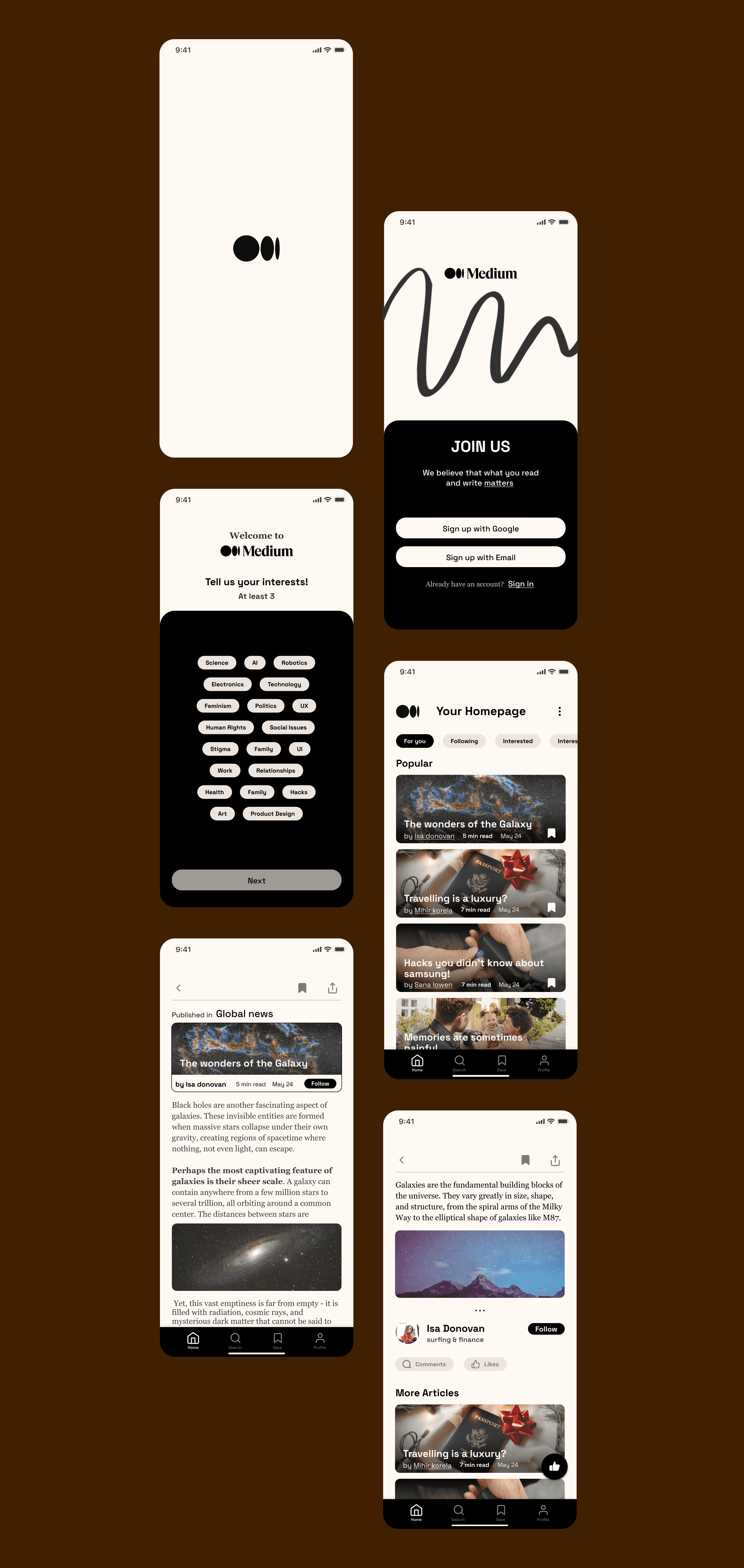
The new design flow focuses on:
Creamy whites, bold blacks.
clean, serif-meets-sans aesthetic.

Bhargavi Kokate 2025
Mumbai