Gym Mobile app Design
Feel Good

Project Overview
FEEL GOOD is a gym app that empowers users to book workout sessions and track their fitness journey. This is an app of an fictional gym studio to help its members.
With a user-centric approach, this app aims to simplify the gym experience by providing convenient access to schedules, workout plans, and progress-tracking features, all in one place.
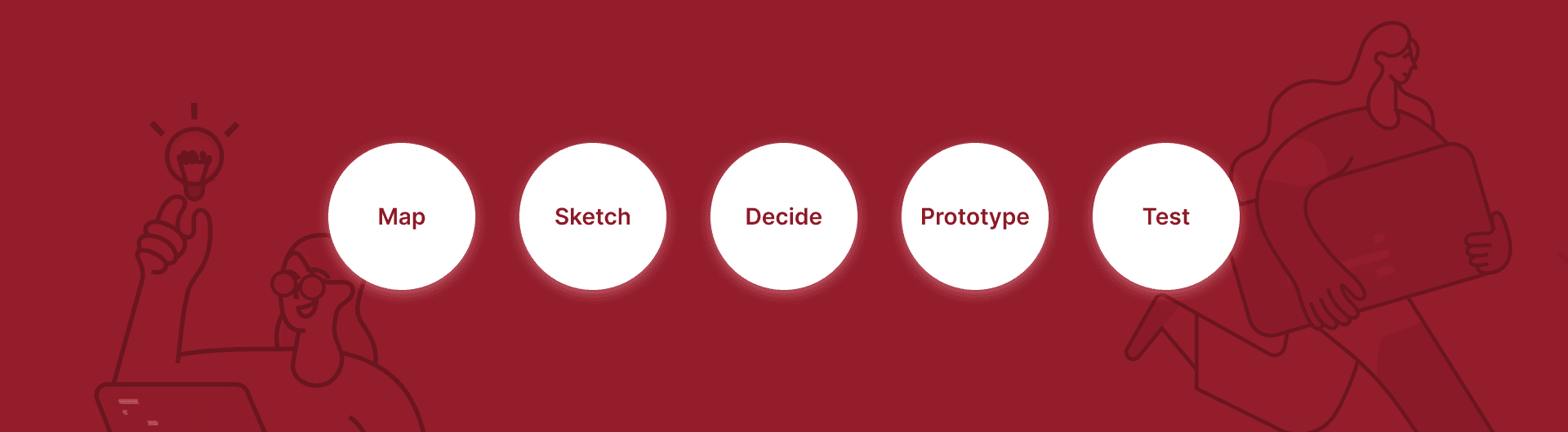
The GV Design Sprint, developed by Google Ventures, is a 5-day process for solving product challenges through rapid ideation, prototyping, and user testing. The sprint allows teams to go from problem to tested solution in just five days.
I chose this method because:
The app concept was well-defined but needed a structured, creative process to validate the idea.
The sprint method ensures we explore multiple ideas before prototyping and make decisions backed by early feedback.
I started by clearly defining the problem:
“How might we help busy individuals stay committed to their wellness goals through an intuitive mobile experience?”
Key Activities:
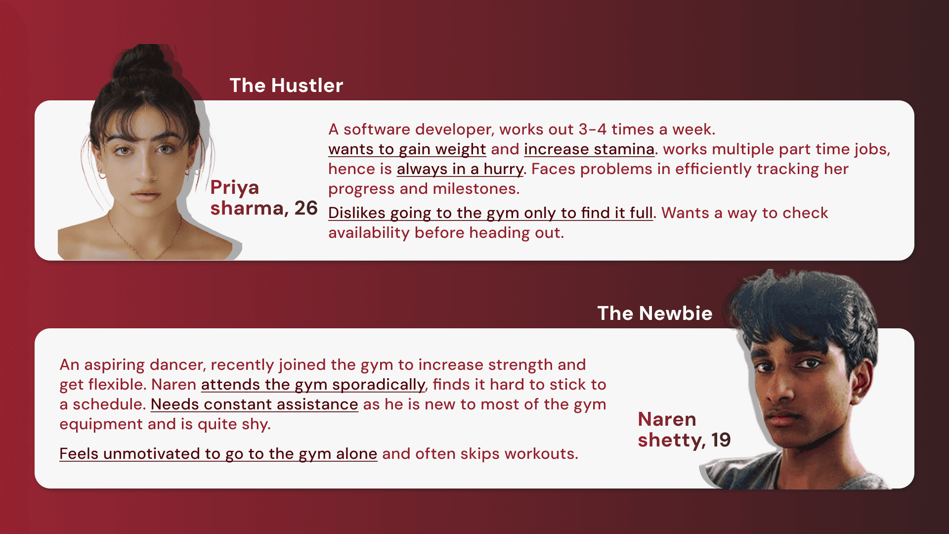
Created quick personas.
Researched existing apps like Healthifyme and Cult.Fit to gather inspiration and understand gaps.
🎯 Goal for the sprint:
Design a simple, motivating mobile experience for fitness booking and progress tracking, tailored for busy schedules.
Market research
Many gyms and fitness centers offer apps that let members book workout sessions, manage memberships, and track progress.
Cult.fit in India provides a feature-rich app for booking classes, accessing fitness content, and tracking health.
Gold’s Gym also offers an app in some regions.
others use platforms like Mindbody or Zen Planner—popular white-label solutions used by small and mid-sized gyms to handle bookings, schedules, and member management.
These apps and platforms generally share core features: session booking, class schedules, membership management, and progress tracking.
However, many lack personalized fitness recommendations, integrated progress tracking.
This phase focused on exploration and creativity.
What I did:
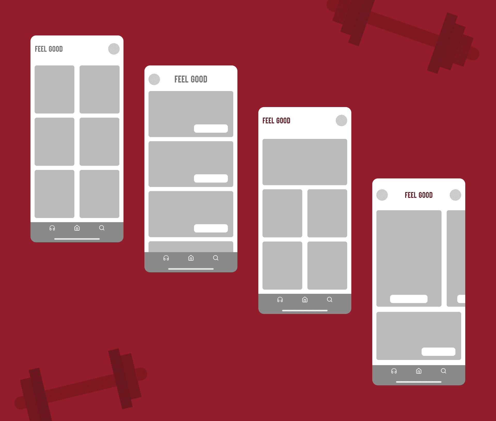
Generated layout ideas around the booking + tracking experience.
Created rough wireframes to visualize core features:
Session booking
Progress tracking
🎨 I aimed for a balance between utility and simplicity, ensuring the design wouldn’t overwhelm new users.
With multiple ideas on the table, I used structured critique to choose the strongest direction.
Final Decisions:
Prioritized a standard no scroll homepage.
Created easy to use progress tracking pages.
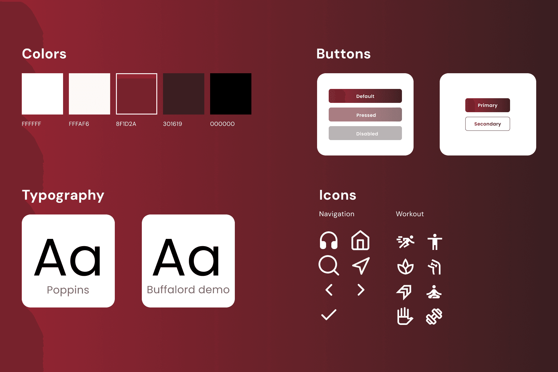
Created a design system.
💡 I chose this path because it focused on user clarity, fewer taps, and personalization, solving both emotional and functional goals.
I quickly built high-fidelity screens covering:
Onboarding.
Homepage.
Session booking flow.
Progress tracker.

We tested the prototype with 3 peers and early users.
What We Learned:
“Loved the clean interface — it made me feel calm.”
“The booking felt quick, but I missed a ‘reminder’ option.”
Key Insights:
Users appreciated the minimal interface and focused content.
The clean interface was easier to navigate and complete user goals.
Learnings
Although the GV Design Sprint is traditionally a 5-day process, I completed this project over the course of three weeks. As someone still learning and building my design process, I intentionally took my time with each phase — not to rush to a solution, but to truly understand the "why" behind every decision.
This slower pace allowed me to:
Dive deeper into research and user behavior
Explore multiple ideas before narrowing down
Iterate thoughtfully based on user feedback
Rather than viewing the sprint as a strict deadline, I approached it as a framework for structured creativity — one that helped me stay focused, make meaningful progress, and end with a tested, human-centered design.
This case study taught me not just how to build a product, but how to think like a designer — balancing speed with intentionality and always keeping the user at the center.

Bhargavi Kokate 2025
Mumbai